How to use Tones and Accents to create a Pop of Colour
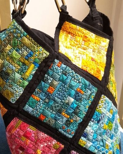
Recently, my mother, who is an absolute national treasure when it comes to embroidery, wanted a new project. She wanted to make me a tapestry patchwork bag for my birthday. “What colour would you like” she asked? “All of them” I said, and so began my bag of many colours. Each square concentrated on a different colour, only blues for example, but then for interest she was to add a small pop of colour or accent. This was such a great exercise in colour, that I am going to show some examples.
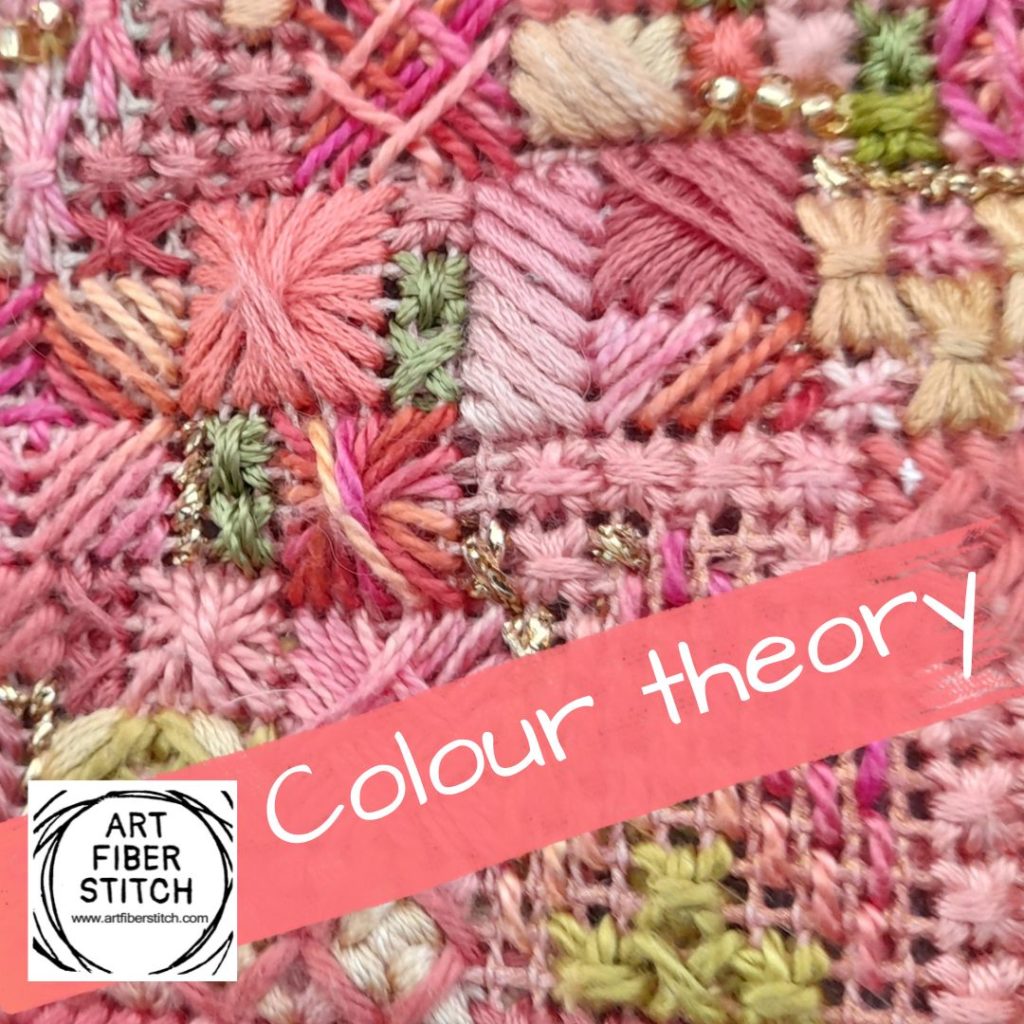
Like this one in dusty rose pinks. Note that it is predominantly that colour, some are lighter, some darker, even some neutral straw colours fit into it, but then as highlight we have that touch of green. It would have been a little bland without that. Let us look at the colour wheel. You will note that all the pinks she used were in the pink to orange pink range in the colour wheel. Nature will always point out colours that work well together, this is reminiscent of a rose, and the green of the foliage.
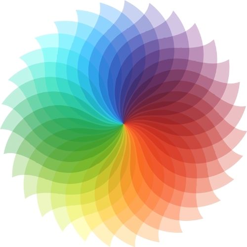
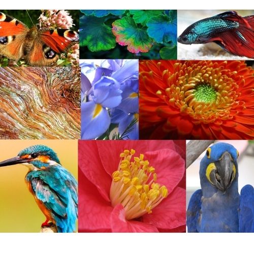
You will quite often find that colours that blend well together are close relatives on the colour wheel, and the colour directly opposite works well as an accent colour. Nature abounds with great colour combinations. Look at the picture below, the turquoise fighting fish with the scarlet tail, the vivid blue parrot with the yellow highlight colour. Next time you are trying to work out what colours to make your new project, have a look around you. Or, try Pinterest, it shows you perfectly. Just search for colour palettes, and see the gorgeous colour combos for yourself. Talk about inspiration.
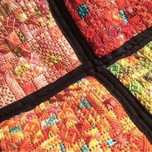
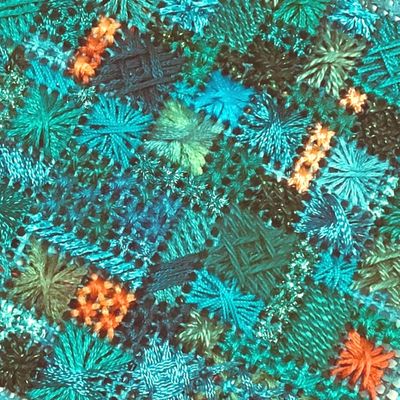
And what about my bag of many colours. Well, here are a few more pictures for you. This one is very close in colouring to the kingfisher pictured above. Love the different aqua/turquoise/blue colours with that special pop of bright orange. It is different from the title picture which is more green/teal colouring with a lovely burnt orange accent colour.And this picture below shows four of the squares bordered in black and sewn together. Lovely colour combinations. I think she has done a great job, making all those very different squares meld together. We have a nice red one through to orange with a pop of jade, orange tones with aqua, and greens and with an orange highlight colour. The black border is what has allowed all these squares to sit happily side by side, it separates each square and gives a definite end to one colour range before another is started.
Here is the finished bag, or at least one side of it. It is a masterpiece in colour and I get many lovely compliments from people when I wear it out. It is unique! Now I am not saying that every project you do should follow these examples, I have seen beautiful work in just beige, that have used texture as the accent. But if you are someone who struggles with colour do start looking around you and noticing the colours of nature
Right here is the perfect webpage for everyone who really wants to find out about this topic. You understand a whole lot its almost tough to argue with you (not that I personally would want toÖHaHa). You definitely put a fresh spin on a topic thats been written about for years. Wonderful stuff, just wonderful!
Thank you so much!
I really enjoyed your color Theory post here and your mothers embroidery is amazing and her use of colors so beautiful. A great example of mixing colors. Thank You!
She really is a marvel! Thank you for your kind words.